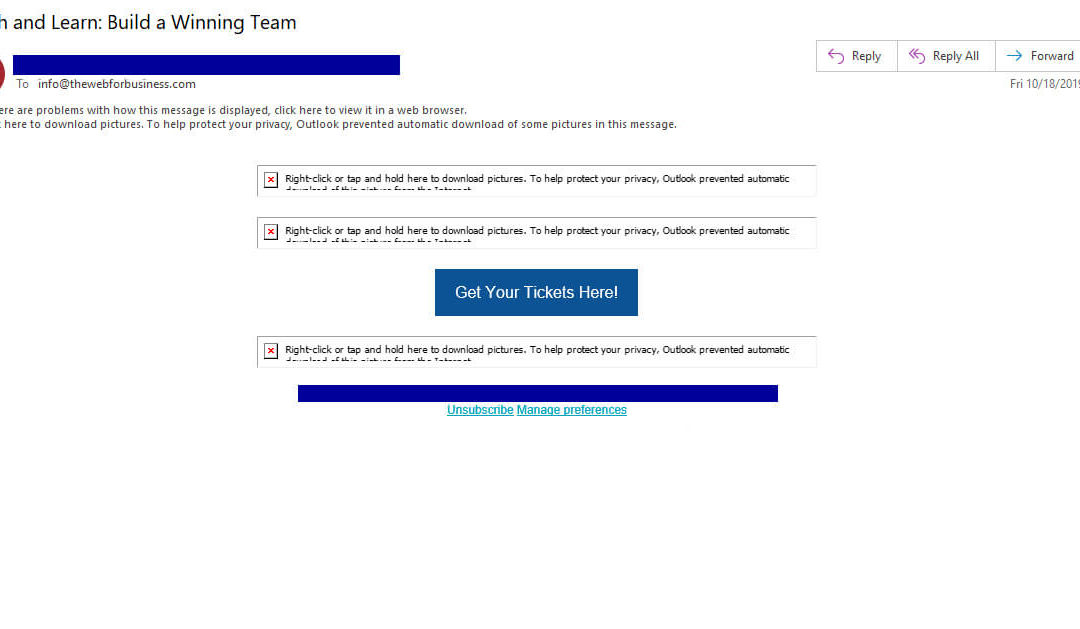
The above graphic is what we received from a local chamber of commerce. This is an example of an image-only email message. When you want the most from your email marketing campaign, you should avoid creating these types of messages.
4 Reasons to Avoid Creating Image Only Email Messages
- Spam Filters – This message wound up in my spam folder. Image-only emails are a common tool spammers use to get around email filters that would otherwise discover their message. Many spam filters now give image-only messages a higher spam score which can put your message into your recipient’s junk folder. Not great.
-
Lower Clickthrough Rates – People who get your emails want to know what it’s about in a hurry, even when they know it’s from you. A good subject line’s a good start, but if there’s nothing to see in the body of the message except “images not displayed”, they’re not going to read and they’re definitely not going to click to learn more.
If you are emailing to a business audience, keep in mind that many of them use Microsoft Outlook (desktop version). Outlook has images turned off automatically. Additionally, research shows more than 40% of Gmail users have their images turned off. If you want your message to be read, using some text can be helpful to convey the most important information.
- Longer Download Times – On mobile your messages can take a long time to download. This is annoying and leads to lower clickthrough rates. For users with data limits, this can also be expensive.
-
Non-Responsive – Image-only messages received on mobile phones may not display properly because the image is too big for the screen. Making your recipients swipe left and right or zoom in and out to see your message is an annoyance. Making recipients do this is a subtle way you show you don’t understand them or don’t care about them. Either way, you’re not enhancing the warm and fuzzy feeling you want them to have about your organization.
You may think that because you’re using an email marketing software that it sets things up so images will be automatically re-sized when being viewed on mobile. That sounds good, but realize the text in your graphics may become small enough that recipients can’t read them on their small screens. If a recipient can’t read your message, they’ll delete it.
Please note I am not saying to completely avoid images in your email messages. Proper use of images can enhance your message. Avoiding image-only messages has benefits that most email marketers can’t ignore.
By the way, who can”get away” with ignoring this advice? Usually it’s organizations that think they have a great brand who are loved by their users. For these organizations, I still think it’s beneficial to avoid image-only emails. Your brand is only as strong as your user’s feelings about it. Anything you do to tarnish their perceptions about your brand can be harmful in the long run.
What do you think? Does your organization use image-only email messages? How are they working for you? Let us know in the comments below. Thanks for reading today and stay tuned to tomorrow’s email marketing tip!


Recent Comments